 Bell Telephone Signs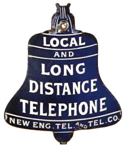
A symbol takes shape
The birth of the Blue Bell
While strolling down New York’s lower Broadway during 1888, Angus Hibbard observed that trade signs painted blue and white seemed to stand out best. Hibbard was general superintendent for the American Telephone and Telegraph Company—then called the Long Distance Company. AT&T had been established in 1885 as a subsidiary of the American Bell Telephone Company to connect distant cities with long-distance lines. As public pay phones became more widespread, the company still lacked a standardized sign marking their locations.
Many vendors advertised by hanging large symbolic examples of their wares above the sidewalk. Hibbard asked: why not symbolize Bell telephone service with the outline of a bell? The Bell interests’ first telephone advertisement, released in May 1877, had referred to Professor Bell’s “Speaking and Singing Telephone.” The Liberty Bell offered a familiar American image that also coincided with the Bell patents and Alexander Graham Bell’s name.
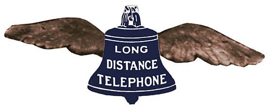
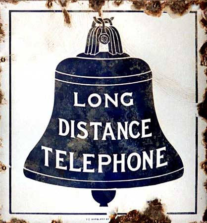
Hibbard’s first sketch placed a blue Liberty Bell on a white ground and added wings to suggest the flight and speed of modern telephone transmission. In white letters it read “LONG DISTANCE TELEPHONE.” He showed the sketch to Theodore Vail, president of AT&T. After discussing what would help the public find—and use—a Bell pay station, they removed the wings and adopted the simpler design during the spring and summer of 1888.
A letter dated August 17, 1888—not 1889—signed by Hibbard and offering “iron enamel signs” bearing the blue bell symbol survives in the Southern New England Telephone Company archives. The Great Blizzard of March 1888, when Angus A. MacDonald patrolled the Boston–New York Main Line open-wire toll route in West Boylston, Massachusetts, was a singular event that convinced Hibbard of the need for a meaningful symbol reflecting the “SPIRIT OF SERVICE.”
“Why not symbolize Bell telephone service using the outline of a bell?”
A sign spreads
From Wrentham to the long lines
In autumn 1888, a long-distance public telephone station was installed in a Wrentham, Massachusetts drug store. Located in New England Telephone & Telegraph territory, it was looped to AT&T’s Providence–Boston long-distance line. It became one of the first—if not the first—recorded locations to display the Blue Bell sign.
The Blue Bell soon appeared wherever AT&T built long lines and established public telephone stations. “LONG DISTANCE TELEPHONE” signs were made in both iron enamel and etched glass for early telephone-booth windows. The Marsland Company of New York offered 6-by-10-inch glass signs and supplied the same message on enamel signs, often mounted to a wooden signboard hanging from a sidewalk bracket. Another series was produced in England for AT&T, usually with a side-mounting bracket.
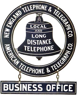
Local Bell operating companies did not gain the benefit of the Blue Bell until 1895, when “LOCAL” was added to “LONG DISTANCE TELEPHONE.” The new wording showed that both exchange and long-distance service were available. Original long-distance-only signs often remained at locations served locally by non-Bell companies well into the twentieth century.
Vail wanted to register the symbol, but the Liberty Bell was already a popular motif. When the company applied to the U.S. Copyright Office, it discovered that a Boston fish dealer had registered a similar trademark. Many years passed before the Blue Bell became a registered service mark.
New England reorganizes
One company, one system
New England—home of the American Bell Telephone Company—became the breeding ground for early Bell licensees. Southern New England Telephone was an early force in Connecticut exchange service and eastern New England toll service, with lines extending into Massachusetts and Rhode Island. Its president, Marshall Jewell, planned one Bell operating company for all New England.
Jewell’s untimely death in early 1883 thwarted the proposed consolidation of Southern New England, Connecticut, Inter State, Providence, Boston and Northern, National Bell Telephone of Maine, Bay State, Granite State, Suburban, Ingham, Glidden and Downe, and Southern Massachusetts Telephone. From the resulting turmoil emerged New England Telephone & Telegraph Company.
Chartered in New York on October 19, 1883, NET&T consolidated Telephone Dispatch, National Bell Telephone of Maine, Boston and Northern, Granite State, and Bay State and Suburban. Bell companies in southeastern Massachusetts, Rhode Island, and Connecticut were not included. A lesser-known New England Telephone & Telegraph Company of Massachusetts was chartered in 1888 to maintain pole rights with the Edison Electric Illuminating Company of Boston; its parent was NET&T.
NET&T became the home regional operating company for American Bell, controlled by Boston financiers. Its New York charter brought additional capital and helped lead to AT&T’s takeover of American Bell in 1900. American Bell employees called the licensed companies the “System.” Although “Bell System” entered national media advertising in 1908, evidence suggests NET&T used the phrase on signs before then—possibly as early as 1900.
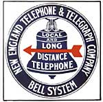
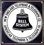
After complaints about poor service and predatory practices toward independent telephone companies tarnished its image, AT&T retained a Boston public-relations and advertising firm called The Publicity Bureau in 1903. A new sign style probably followed: a circular band or wreath surrounding the familiar Local and Long Distance bell. NET&T’s name filled the upper band and “Bell System” the lower. That circular form, in changing versions, endured.
The Publicity Bureau served the Bell interests until Theodore Vail returned as AT&T president in 1907. He ended the agency relationship, formed an in-house public-relations department, and almost immediately adopted “Bell System” for media advertising.
An era of standards
The Bell System finds one voice
The 1921 redesign began with Vail’s 1911 announcement that local Bell operating companies would be consolidated into a much smaller number of state and regional companies. AT&T had acquired hundreds of independent telephone companies over the prior fifteen years; many had faltered financially and lacked capital to modernize. By 1912, the Department of Justice was pursuing antitrust action.
Vail had opposed allowing independent companies to connect physically with Bell System toll circuits. The 1913 Kingsbury Commitment changed that policy: AT&T agreed to promptly arrange for other telephone companies to secure toll service for their subscribers over Bell System lines.
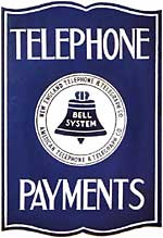
As AT&T’s Publicity Department designed the 1921 logo, standardization was sweeping the country—from highway signs to manufactured parts. Western Electric standardized and numbered the Bell System sign set. The 8-inch round was No. 1; the 11-by-11-inch flat square No. 2 and flanged counterpart No. 3; the 2½-by-10-inch flat “Coin Telephone” No. 4; the 5½-by-19-inch single-faced sign No. 5 and double-faced arrow version No. 6; the Blue Bell lampshade No. 7; and the canteen glass sign No. 8.
Additional needs, such as an 18-inch round sign for use under awnings, received their own numbers. Every operating company also received a numbered series beginning in the hundreds. NET&T’s 16-by-16-inch flat sign became No. 101 and its flanged counterpart No. 102. Pacific Telephone’s No. 102 was a gold-lettered, hand-painted sign.
Reflecting Colonial Revival architecture, the 1921 set arrived by that year. The Bell System grew steadily until 1932, when the Great Depression struck Western Electric, the System’s supply company. More than 80 percent of Western’s employees lost their jobs, and the Bell System sharply reduced its advertising budget.
Identity gives way to efficiency
The mark becomes modern
A revised logo entered service by 1939 with a direct message: “PUBLIC TELEPHONE / BELL SYSTEM.” Regional identity yielded to efficiency. Instead of stocking and ordering eight different signs for each of twenty-seven companies, the system could stock ten or fewer common designs.
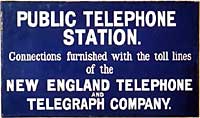
Southern New England Telephone introduced the so-called 1939 sign during 1938; it appears in photographs of the great New England hurricane. The “1939” designation may therefore be arbitrary—a “not later than” date. Some operating companies preserved a measure of regional identity. NET&T, perhaps the most prolific Bell company in sign styles, kept its 1921 signs in service as long as possible and added its name to at least four 1939 designs.
Postwar Blue Bell changes followed in 1964 and 1969. Both simplified the logo. The 1964 version removed “American Telephone and Telegraph Co. and Associated Companies”; the 1969 version also removed “Bell System.” That 1969 mark survives today in very limited use by remaining Baby Bells. For those who remember when the Blue Bell was the Bell System, the words “Spirit of Service” remain in their hearts.